
How to Interpret the Fed's Rate Cut Signals: Deciphering Tonight's FOMC Meeting Through Market Data
- Core View: This article points out that the market has already priced in expectations for a Fed rate cut itself. What truly drives significant asset price volatility is the deviation between the actual rate cut outcome and market expectations. It provides three key tools to track and interpret signals regarding the magnitude and pace of rate cuts.
- Key Elements:
- Market Expectation Gap: Observe the probability distribution of rate cuts using the CME FedWatch Tool. If market expectations for larger cuts rapidly intensify, it indicates the market is digesting a "recession narrative," which will trigger significant volatility.
- Fed's Official Intent: Focus on changes in the median interest rate forecast in the Fed's dot plot. If the median shifts significantly lower, it indicates the Fed has raised the "ceiling" for rate cuts, which is a long-term positive signal.
- Judging the Pace of Cuts: Analyze the spread between the 10-year and 2-year U.S. Treasury yields. The current curve shifting from inverted to a slow rise (bear steepening) suggests the market expects rate cuts to be slow and preventive, rather than rapid and substantial.
- Liquidity Impact: Only when the yield curve steepens significantly (bull steepening, i.e., short-term rates fall rapidly) can the market obtain sufficient liquidity, thereby driving significant price increases in assets including cryptocurrencies.
Tonight, the market is closely watching the Federal Open Market Committee (FOMC) meeting, but a key fact is often overlooked: the rate cut itself is usually already priced in by the market. What truly drives market volatility is not the rate cut itself, but the deviation between the actual outcome and market expectations.
As I've emphasized before, regarding rate cuts, the real interest rate, along with the magnitude and pace of the cuts, is more important than the nominal rate. These two factors are the key signals driving asset price movements.
Today, I will show you how to capture these signals through data—transforming you from a casual observer into someone who can see beyond the surface and understand the real drivers of the market.
Deciphering the Fed's Rate Cut Signals: Tracking the Pace and Magnitude
1. Market Expectation Gap: CME FedWatch Tool Predicts Fed Rate Cut Probabilities
This is the most intuitive tool for quantifying the magnitude of rate cuts. It calculates the probability of rate cuts based on federal funds futures prices.
The key is not only whether the Fed will cut rates at the next meeting, but also understanding the probability distribution of the cuts.
If the market initially expects a 25 basis point (bp) cut, but the FedWatch tool shows the probability of a 50 bp cut surging from 10% to 40% within a few days, this indicates the market is pricing in a larger "recession narrative," and volatility will rise sharply.
Every shift in rate cut expectations creates ripples in the market. As I mentioned earlier, the impact of rate cuts is usually already priced in—what causes sharp price swings is the deviation between the actual outcome and market expectations.
Pay close attention to the magnitude of changes in market expectations for different rate cut sizes as shown in the chart. These expectations ultimately depend on U.S. employment and inflation data.
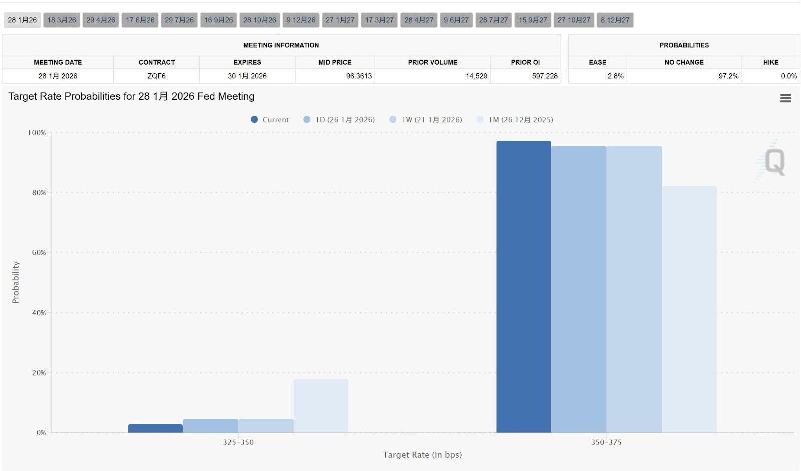
https://www.cmegroup.com/markets/interest-rates/cme-fedwatch-tool.html
2. The Fed's Official Rate Cut Intentions: The Dot Plot
This dot plot is released quarterly and shows the individual forecasts for future interest rates from the 19 Fed officials.
What we need to examine is the dispersion of the dots and the change in the median.
If the dot plot shows a significantly lower median interest rate for the end of 2026 compared to the previous quarter, it indicates the Fed has raised the "ceiling" for rate cuts—a positive signal for the long term.
Both the dot plot above and the market expectation gap help us gauge the magnitude of the rate cuts.
3. The Fed's Rate Cut Pace: Analyzing the 10-Year vs. 2-Year U.S. Treasury Yield Curve
The 10-Year vs. 2-Year U.S. Treasury yield curve reveals professional bond traders' views on the pace of rate cuts.
The principle is simple:
- The 2Y represents the policy rate for the next two years, directly controlled by the Fed's rate actions.
- The 10Y represents long-term economic growth and inflation expectations.
What's the current situation? We are now in the "yield curve inversion reversal" phase (the 10-year yield is starting to be higher than the 2-year yield again, or the gap between them is narrowing).
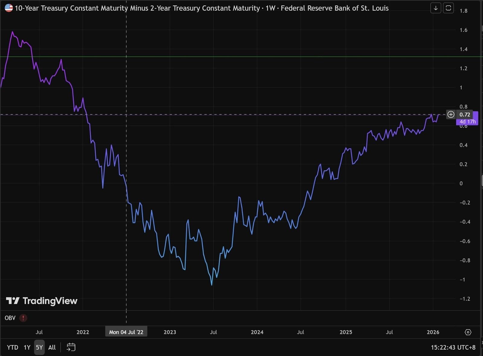
https://www.tradingview.com/chart/O9lEPyjs/?symbol=FRED%3AT10Y2Y
- Understanding Yield Curve Inversion
Normally, due to longer duration and greater risk, long-term bonds should have higher yields than short-term bonds. If the 2-year bond yield exceeds the 10-year bond yield, this is called a yield curve inversion—a signal of a potential economic recession.
This phenomenon occurs when the market believes current inflation is too high or the Fed has raised rates aggressively, causing short-term financing costs to soar. The two-year Treasury yield is closely tied to the policy rate.
Meanwhile, on the 10-year Treasury side, traders believe that with rates so high, the economy will eventually be "crushed."
When the economy weakens, future inflation will disappear, and the Fed will eventually be forced to cut rates sharply. Therefore, investors rush to buy long-term bonds to lock in current yields.
More buyers drive up the price of 10-year U.S. Treasuries, causing their yield to fall.
That's why we can see from the chart that the 10-year vs. 2-year yield curve was previously inverted, changing from -1.04 in 2023 to the current 0.57, gradually reversing the inversion trend.
- How to Interpret Fed Rate Cut Signals from Yield Curve Reversal
Looking at the 10-year vs. 2-year Treasury yield curve, the trend is upward, but the difference lies in what is driving this increase.
Remember this formula: 10Y - 2Y
Bull Steepening - Rapid rate cuts are favorable for liquidity.
- Spread chart movement: The curve steepens sharply, rising rapidly.
- What's actually happening: The 2-year Treasury yield (short-term) is falling much faster than the 10-year Treasury yield.
- Market logic: Weak economic data leads the market to believe the Fed will cut rates quickly and significantly.
Bear Steepening— Slow rate cuts / inflation rebound, unfavorable for liquidity:
- Spread chart behavior: The curve rises slowly or fluctuates upward repeatedly (as shown by the wavy movement in early 2026 on the chart).
- What's actually happening: The 10-year Treasury yield (long-term) is rising, while the 2-year yield is rising or falling very slowly.
- Market logic: The market fears an inflation rebound (expectation of rising inflation again) or believes the economy is too strong for the Fed to need to cut rates.
Clearly, we are currently in a bear steepening phase. Looking at the 10-year and 2-year yield curves separately, their 5-year trends both show a recent upward movement.
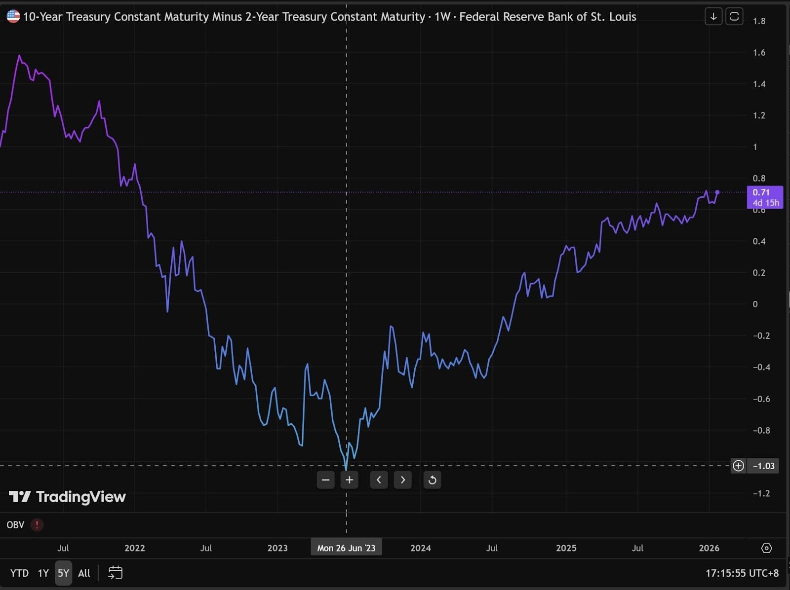
This means the current rate cuts lean towards "preventive cuts"—the Fed is cutting rates gradually, like squeezing toothpaste, a little at a time with pauses.
When Will the Market Truly Feel the Impact of Fed Rate Cuts?
Only when the 10-year vs. 2-year yield curve can steepen more significantly will liquidity enter the cryptocurrency market and asset prices truly surge.
When liquidity is injected, various industry narratives emerge to ignite the market.
Narratives are just the surface—narratives can be in any field, like an actor pushed onto the stage. What truly matters is how many paying spectators are watching from below.
The above views are from @AAAce4518


