
When liquidity disappears: Micro-data decodes the 10.10 flash crash and finds overlooked market signals
- 核心观点:10月10日加密市场发生系统性去杠杆崩塌。
- 关键要素:
- 币种平均跌幅达63%,创历史记录。
- 永续合约未平仓量暴跌近50%。
- 流动性枯竭致交易成本激增500%。
- 市场影响:暴露高杠杆系统脆弱性,引发监管关注。
- 时效性标注:中期影响
Author | ltrd
Compiled by Odaily Planet Daily ( @OdailyChina )
Translator | Dingdang ( @XiaMiPP )

Every market cycle has a "day that changes everything." October 10th was one of those days. Over the course of a few hours, the crypto market unravelled in a slow-motion collapse – leverage was forced to liquidate, collateral evaporated rapidly, and liquidity dried up instantly. But this wasn't a panicked crash; it was a mechanical, precise collapse – a reminder that a system doesn't fail because it's fragile, but because it continues to function under extreme circumstances. This article attempts to reconstruct the truth of that day through data – cutting through the hype and emotional outbursts to get to the heart of the matter.
October 10th was destined to go down in history. By almost every metric, it was the most severe flash crash in crypto history. A perfect storm of factors: portfolio margin liquidations, automatic position reductions (ADLs), the potential liquidation of multiple major players, and the plummeting value of collateral—all combined to trigger the worst single-day drop in crypto to date.
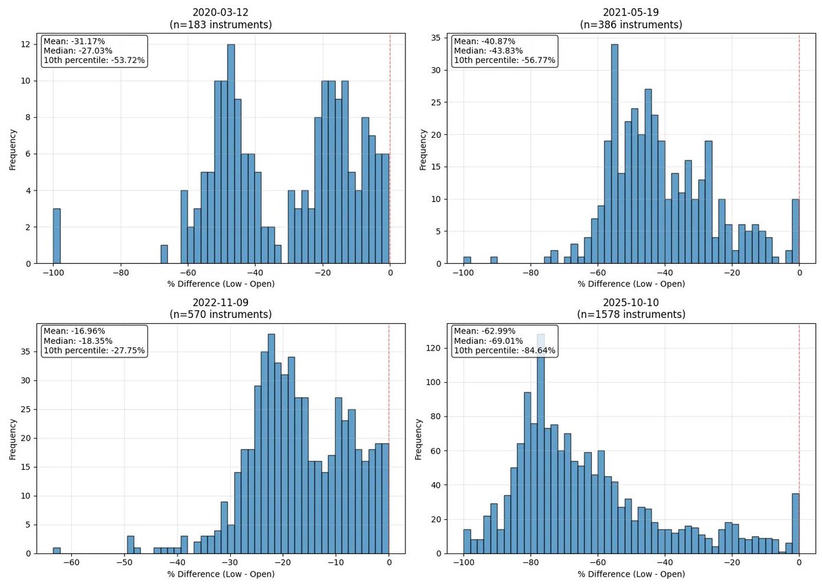
First, a quick overview – just how bad was this crash?
I've chosen four of the craziest trading days in crypto history (granted, there were plenty of turmoil in the early years, but this post focuses on the "modern crypto era"). I've done the same analysis on those days, and the conclusion is this: October 10th was the most violent sell-off I've ever witnessed.
As the chart shows, the average daily drop (calculated from the opening price to the daily low) was a whopping 63% ; the second-largest day (May 19, 2021) saw a drop of only about 41% . Approximately 200 cryptocurrencies on Binance have seen drops exceeding 80% , a figure comparable to the exchange's entire listing during the 2020 COVID crash.
As always, we'll start with a high-level overview and then delve into the market's microstructure—the real understanding lies in the details. We'll begin with the most fundamental indicators: open interest and macroeconomic conditions , and gradually unravel the complex mechanisms layer by layer.
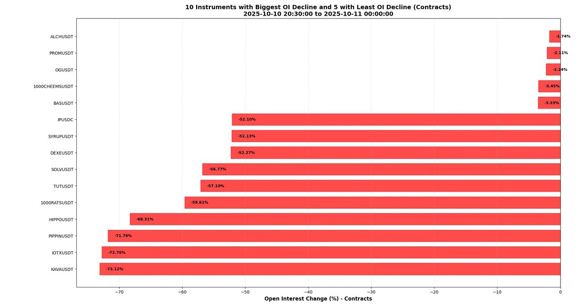
This drop nearly completely destroyed market structure. As the chart below shows, open interest on Binance perpetual contracts dropped by nearly 50% on average . Over 50 trading instruments saw open interest drop by over 64% . This means that during the crash, over half of all contracts were closed—either through forced liquidation, ADL, or manual liquidation. Open interest can be roughly interpreted as market size, so we can say that the market shrank by approximately 50% on average that day.
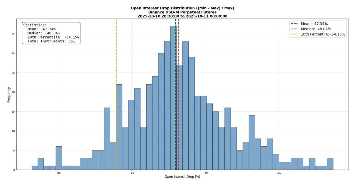
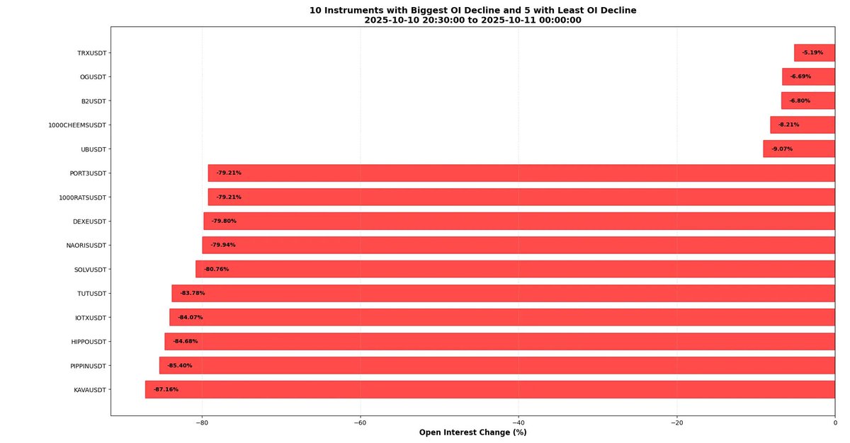
Open interest in some instruments has plummeted by as much as 80%. This means that less than one-fifth of all contracts have "survived" —an extremely extreme figure by any standard. The table below highlights the extremes: KAVA, with its open interest collapsing by nearly 90%, has earned the spot on the list of shame, while TRX has barely budged, declining only about 5%. This clearly reflects the high leverage in some markets and the brutal nature of the deleveraging process.
Maybe it's not wise to be deliberately wrong when trying to attract the attention of smart people - but I did it. I hope you noticed:
The above figures appear large because they are denominated in US dollars (USD) —a measurement that is inherently biased in the context of plummeting prices. When prices plummet, open interest measured in USD naturally looks worse than it actually is. What matters is open interest measured in "number of contracts," not the USD value . I've seen some analysis claiming open interest has dropped by around 50%, but if these figures are expressed in USD and the underlying price has fallen significantly, that conclusion is inaccurate.
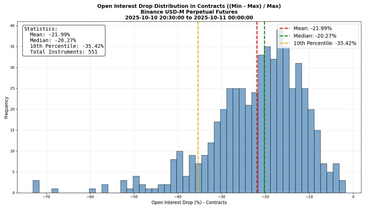
Let's look at the more precise data: the average contract volume fell by about 22% (still astronomical, but not quite as alarming) . Be cautious with interpreting this data—many people, myself included, try to shock readers with numbers when presenting their conclusions, sometimes resorting to some gimmickry.
Even so, the data for individual coins is still striking: the number of contracts for some tokens has decreased by over 70% , and combined with the plummeting prices, the total dollar value of open interest has fallen by approximately 90% . I'm not sure why, but I was a little surprised to see coins like KAVA and IOTX on the list. I would have expected coins like PIPPIN or HIPPO, where traders (by definition) generally prefer higher leverage than in established coins.
Market microstructure
Now let's focus on market microstructure. I'll analyze examples, hoping to provide a clearer picture of the market's actual trajectory and new insights. While there have been many excellent analytical articles discussing this crash, few have delved into the microstructure.
Of course, let's start with BTC. The chart below shows CVD (cumulative volume difference) across various exchanges— the difference between active buys and active sells over a period of time (measured in USDT) . For example, -1e9 indicates $1 billion more in active sells than active buys. However, it's important to note that this is only a rough approximation of market pressure. In the crypto market, where tick sizes are extremely tight, the proportion of fillable limit orders is much higher than in other asset classes, resulting in a lower accuracy of CVD. (Leave it to your own question: why is this so?)
As you can see from the chart, CVD indeed showed strong selling pressure. However, it's interesting to note that while the CVD drops in Cases 1 and 2 were similar, the prices were vastly different. This is primarily due to the extreme lack of liquidity in Case 2—thus, even with the same selling pressure, the price reaction was more dramatic.
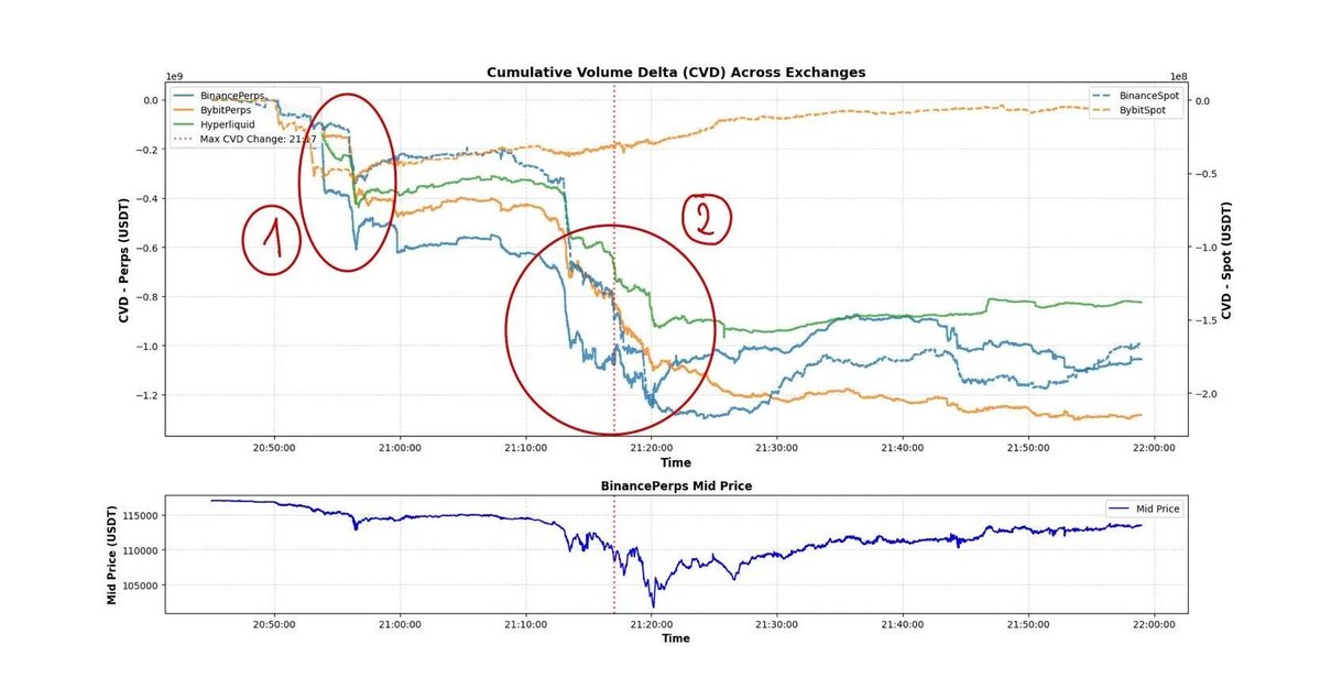
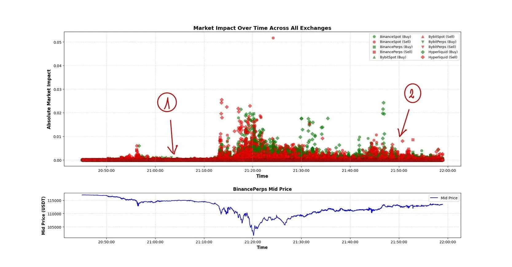
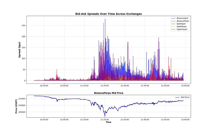
Liquidity, especially in the second phase, was abysmal. The chart below shows two indicators: the magnitude of the price shock caused by a single market order and the bid-ask spread across exchanges . This clearly demonstrates the depth of the market disruption. The difference between Scenario 1 and Scenario 2 in the market shock chart demonstrates the extreme fragility of liquidity following the continuous plunge. It's likely that a large number of market makers and arbitrageurs paused trading to assess the situation, or significantly widened the bid-ask spread.
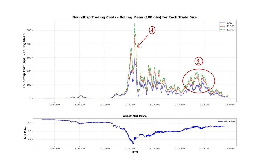
A key metric for measuring market volatility is shown in the chart below: XRP's "roundtrip cost" during the crash . Roundtrip cost refers to the cost, expressed as a percentage, of executing two opposite trades (a buy and a sell) at the same instant. On Binance, the most liquid exchange in the crypto market, for about an hour during the crash, a $500 trade incurred a 1% roundtrip fee. At its peak, the roundtrip fee for a $2,500 trade exceeded 5%. This is insane! This is why I often emphasize " liquidity-adjusted market capitalization ": because the market we live in is inherently illiquid. While this was an extreme event, moments of instantaneous liquidity loss occur all the time, and we should delve deeper into this phenomenon.
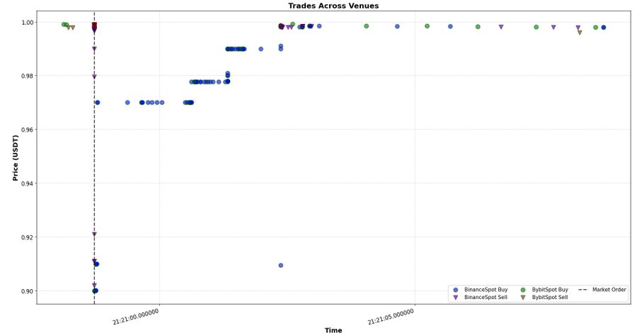
Now that we understand the scale of the liquidity loss, we can take a closer look at the market's microstructure. The chart below shows all BTC transaction data across multiple exchanges. We can analyze several key points:
- There is a significant price differential between Hyperliquid and the rest of the market —this is likely due to short-term pricing discrepancies between USDT and USDC (all other exchanges in the chart are quoted in USDT). During periods of extreme volatility, price fluctuations of these stablecoins must be incorporated into fair value models.
- Frequent large market orders —likely arbitrage hedging orders. The high frequency of these orders suggests the order-makers are largely indifferent to immediate price fluctuations.
- Strong price shocks trigger other algorithmic trades – creating a self-reinforcing chain of transmission.
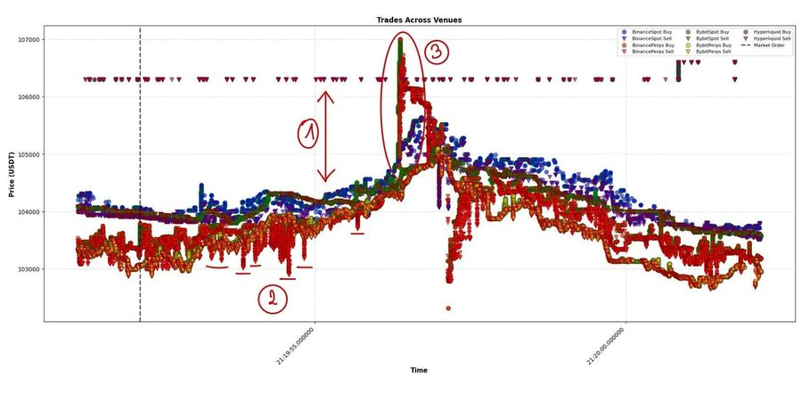
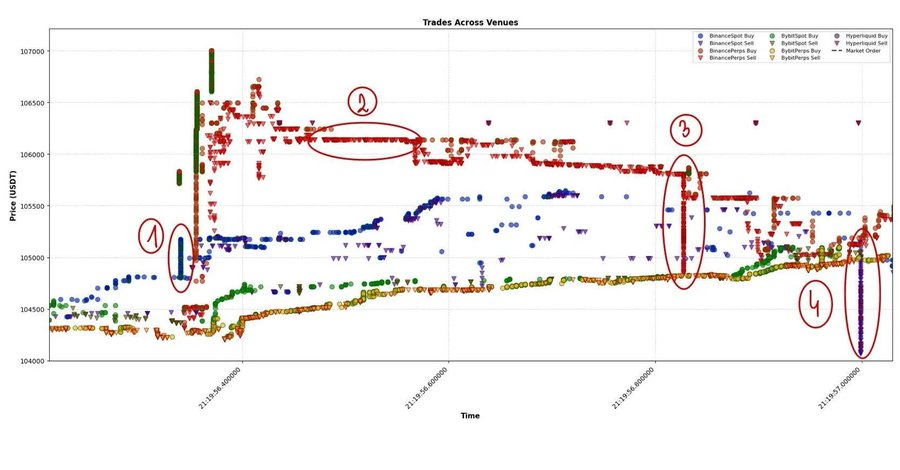
Let’s take a closer look at scenario 3, which has been the core area of my research over the past few years – reviewing thousands of similar events tick-by-tick, trying to understand the logic behind them.
How do we “decode” such an event? First, (1) is the signal of inter-market transmission . The Binance spot market initiated the large market order this time. According to analysis, Binance (spot) is not the main price driver in periods of low volatility, but in this event, it has more frequently become the starting point of market fluctuations. Subsequently, other exchanges followed suit with millisecond delays. The key here is: the difference in market impact intensity across different trading venues - Binance (spot), Binance (perpetual contracts) and other platforms. It can be seen that after the large market order appeared on Binance, the follow-up intensity of other exchanges was significantly weaker. Therefore, modeling the new equilibrium state of the market after such transactions is crucial to understanding market dynamics and cross-platform transmission mechanisms.
Secondly, (2) although it is not easy to see directly, there may be a large "marketable limit order" . You will notice that it takes a while for the market to completely "eat up" this limit order (here still referring to the part numbered 2). This is very important - especially in data with a small tick size, this "single large limit order" often contains a lot of information, and it can provide key price clues amidst the noise.
Finally, scenarios (3) and (4) may be related. A large market sell order appeared on Binance Perpetual, which then propagated to HyperLiquid at a similar scale, re-establishing cross-platform price equilibrium.
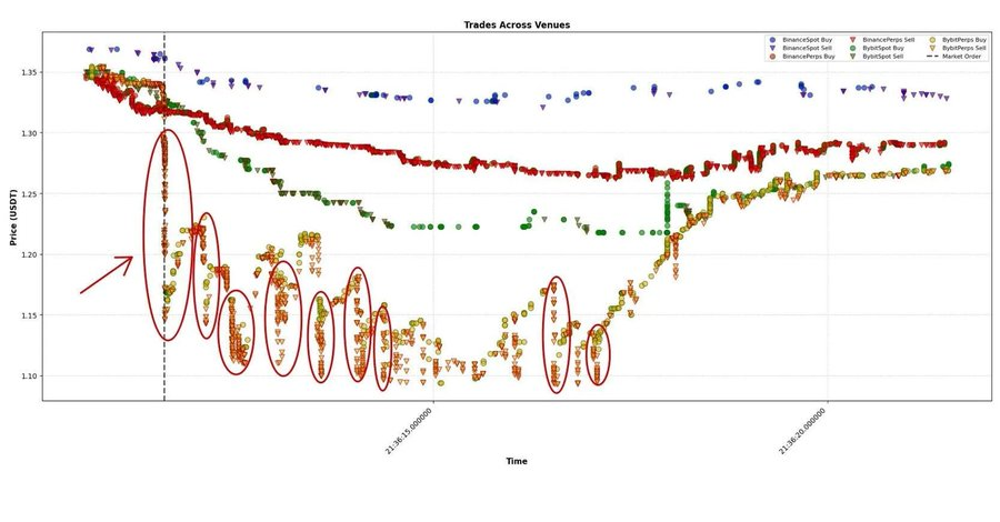
Another interesting example is ASTER. The arrow in the figure marks a large market order that instantly impacted the market by over 10%. The market was severely disrupted, with prices briefly falling several percentage points below fair value. New large market orders were executed every 500–1000 milliseconds. After several seconds, the market gradually returned to equilibrium.
This is a textbook case of decomposing a shock into its "transient impact" and "permanent impact" components: the initial shock and the new equilibrium level.
USDE
There's been a lot of discussion recently about the "depegging" of the USDE and other assets used as collateral for portfolio margin, generating a wealth of debate, rumors, and conspiracy theories. Let's look directly at the data. The evidence shows that this crash was definitely not caused by a USDE depegging. When BTC and the broader market bottomed, the USDE was still trading around $1.
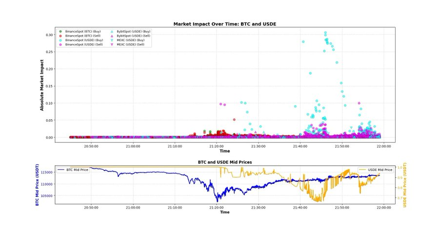
The following chart serves as evidence: there was a fairly large market order that instantly impacted the market by about 10%, but the price quickly recovered to around $1 – this occurred around 9:21 PM, right after the market bottomed out.
An even more surprising finding: looking at the CVD (cumulative volume difference) of USDE and BNSOL. USDE's CVD is not unusual—while the roughly $200 million in selling pressure is significant, most of it occurred after the decline (likely due to executable limit orders matched by aggressive arbitrageurs).
The situation with BNSOL is quite unusual : its price appeared normal until it suddenly plummeted within a fraction of a second—with almost no apparent active selling pressure. This is the result of two factors:
- Liquidity is extremely thin : just after the crash, most market makers have withdrawn;
- The main pressure comes from limit orders - someone has placed a large amount of BNSOL waiting to be traded, and is constantly updating the orders every time the price fluctuates.
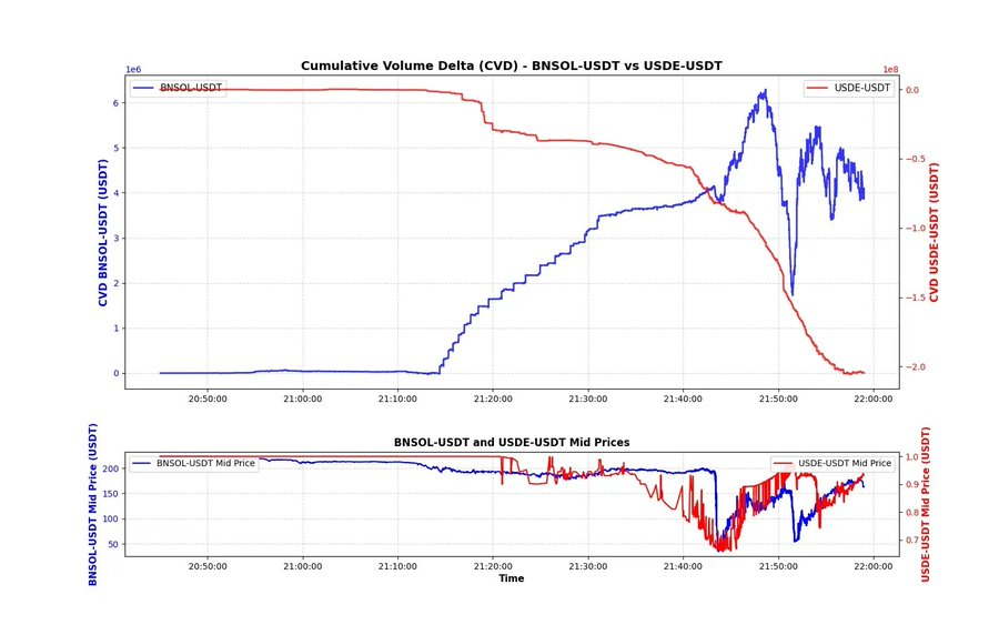
Judging from the data, it's likely that some people were forced to sell BNSOL in exchange for USDT, and they had to do it immediately. Due to insufficient liquidity, they could only sell through limit orders, so this behavior is not directly reflected in the CVD chart.
We may never know the truth, but this explanation seems most plausible based on the data. We could delve deeper—comparing the three assets second by second, as discussed on X—to look for deeper patterns. For now, I'm just looking at the fundamental data to see if there are any immediately apparent clues. I believe the time difference between BTC's bottom and the USDE's bottom, along with the CVD curve shape, can provide some context for understanding the market dynamics at the time.
Market overleverage
Major exchanges have now built extremely complex and sophisticated leverage systems, featuring dozens of assets and dozens of different ways to play: various margin trading models, multi-asset models, and the inclusion of wrapped assets as collateral. Even meme coins, which had just been listed a few hours earlier, could offer 20x leverage. Unfortunately, the events of that day exposed the fragility of this system.
I sincerely hope this incident doesn't set the industry back years. The data from that day offers a glimpse into the typical trader at each exchange—the scale of liquidations on HyperLiquid was particularly staggering, and it wasn't even the most traded perpetual swap platform. The "HyperLiquid era" didn't create this trading mindset—it simply revealed the desires that already existed within traders: unlimited leverage, instant feedback, and a dopamine rush disguised as alpha.
- $100,000 a year? —Boring.
- Retire in ten years, not ten months? — Even more boring.
People chase their dreams, wanting to earn more, and earn it faster. Opening perpetual contracts on illiquid tokens has become the new lottery ticket. Consequently, over the past few months, a new decentralized perpetual exchange (DEX) has launched almost monthly, each introducing new incentive mechanisms that encourage wash trading and extreme leverage. Leverage itself isn't the root of the problem; it's more like a mirror, reflecting how impatient and volatile the market has become. Everyone craves exponential growth in a linear world.
Double-divided death
In such an environment, there are hundreds of ways you can lose money—even if you don’t make any “big mistakes.”
I'd like to give a very simple example to illustrate how you can lose everything in a "normal" trading scenario. Let's assume you're running a very basic statistical arbitrage strategy. You're shorting asset X and simultaneously going long asset Y (e.g., BTC to ETH, DOGE to SHIB, HYPE to ASTER). You have $100 in capital and use 5x leverage (this example applies to different leverage levels, the numbers will just change slightly).
You turn on your computer and discover the market has suddenly plummeted. The chart shows that X (short position) is falling significantly faster than Y (long position)—you secretly rejoice, believing this wave of profits is a sure thing. But what you don't see is that due to excessive leverage, your exchange has already forcibly liquidated your short position through the automatic deleveraging mechanism (ADL). As a result, you are now effectively left with only a "naked long" position. As the market continues to fall, your long position Y is no longer protected by your short position X, and your equity begins to decline in tandem with the price. Soon, your position is forcibly liquidated by the system—while you may still be congratulating yourself on your strategy's "theoretical" performance.

Why am I showing this incredibly basic example? Because I've seen so many people gloat over others' losses, mocking them as "stupid." I absolutely detest this behavior—and that's exactly what I'm trying to say: in a market like this, there are countless ways to lose everything. Believe me, even some of the "big guys" got wiped out that day.
On October 10th, it wasn't hard to lose money. At that moment, your only goal was survival. Don't worry about making a profit, catching a rebound, or finding the bottom; just survive. I hope you survived that day and are ready for the market to come.
October 10th wasn't just a crash; it was a reminder. No matter how advanced our models, infrastructure, or leverage systems, the market will always find the weakest link and hit it hard. It's not necessarily the smartest who survive—it's the most disciplined and the most committed to building the fundamentals. The game will continue tomorrow, just like it always does.


