
Exploring NFT Price Definitions: What's the Best Way to Find Liquidity?
Original translation: Block unicorn
Original translation: Block unicorn
Original title: "Exploring NFT Price Distribution Across Collections"

NFT categories such as virtual lands, PFPs (NFT avatars), and game assets are common frameworks for valuing items and collectibles. However, a less-discussed and sometimes counterintuitive property of these assets is their price "rank" in the collection, and how assets of the same price grade behave in collections and NFT classes.
More specifically, we try to answer 3 questions:
More specifically, we try to answer 3 questions:
What is the price distribution of NFTs across the market?
Have price distribution patterns emerged, and if so, how common are they?
From these distributions, how do we define price "tiers" that might make a given NFT more suitable for some liquidity methods than others?
method
method
NFTBank is an algorithmic asset valuation product that uses machine learning to predict NFT prices based on the past pricing of similar assets. We extracted more than 3 months of data from NFT Bank. The first is December 15, 2021 (279 collections, about 2.4 million NFT, about 3.7 million ETH market value), and then January 13, 2022 (540 collections, about 14.2 million NFT, about 8.9 million ETH market value), Most recently on February 27, 2022 (538 collections, about 14.8 million NFT, about 6.5 million ETH market value)
This article dives into 4 observations we found:
1. The price distribution is usually very concentrated between and within sets.
2. There are 5 main "shapes" of price distributions that don't seem to be related to NFT "categories" (PFP, games, virtual land, etc.).
3. The price distribution generally remains unchanged. For 75% of collectibles, the price distribution remains constant across time points. For those that change, it's toward a "relevant" shape.
4. For ensembles with exponential decay and lognormal-like distribution (60% of ensembles), we can define and examine the behavior of bottom, middle, and top assets.
centralized price distribution
Across the series, the market is concentrated with the top 10 series accounting for more than 60% of the market cap, with a (normalized) Gini coefficient of around 0.9.
In collectibles, most price distributions follow a pattern in which most items are priced close to the reserve price. The few remaining items make up the majority of the price range and thus contribute significantly to the market value of the collection.
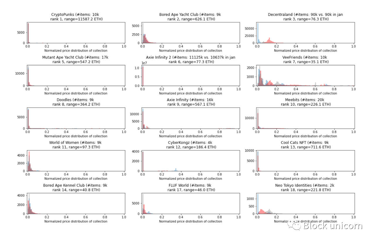
Example of a normalized price distribution chart:
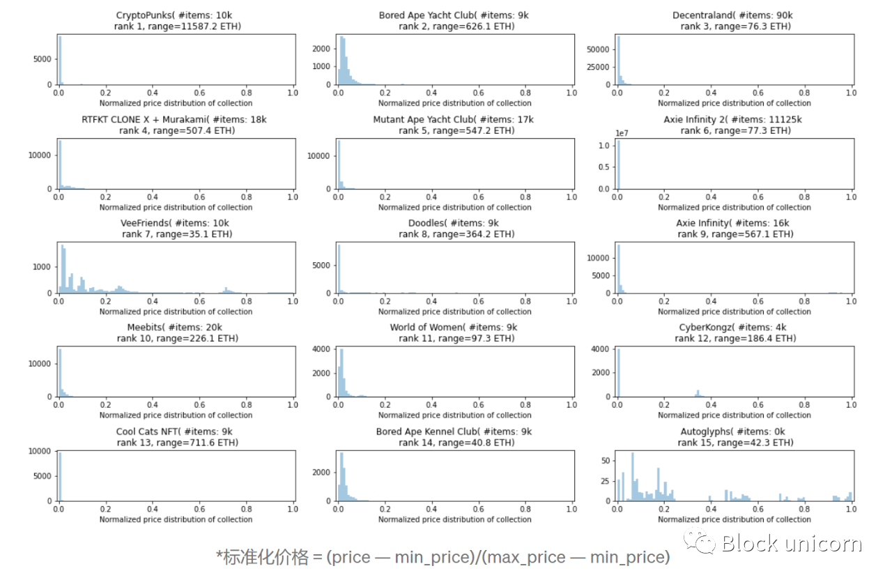
In these charts, the x-axis is divided into 100 equal parts, so for example the first chart (CryptoPunks) shows that almost all punks are priced in the top 2% of the full price range.
This holds promise for NFT financialization products that are best suited for on-exchange projects, for example, liquidity pools like NFTX could act as "on-exchange AMMs" that provide instant liquidity to NFT owners who can transfer on-exchange Assets are traded with pools.
Collections with a large number of on-market items and reliable price feeds (those that are frequently traded across many different unique addresses) can also be used as collateral for P2Pool lending products. This is because floor assets can often be treated "the same" and thus do not require manual evaluation. Loan terms can be automated once price feeds and automated means of assessing risk are plugged in.
However, in the example above, note that some collections, such as VeeFriends and Decentraland, do not fit into this "model is floor price" model. In fact, the price distribution pattern falls into one of 5 different shapes, which brings us to our next observation.
There are five main forms of price distribution
Across the series, the shape of the price distribution we observe is:
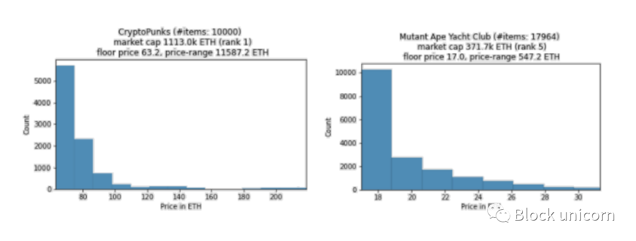
1) Exponential decay. These are collectibles where most of its merchandise is priced on the floor, and there's a long tail of high-ticket items. About 40% of the collections we sampled exhibit this profile. Examples include Cryptopunks, RTFKT Clone X + Murakami, and Mutant Ape Yacht Club
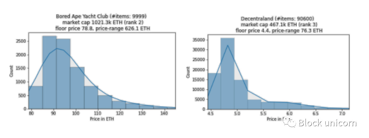
2) The lognormal distribution has a similar shape to the exponential, but the mode is slightly above the floor. About 20% of the collections we sampled exhibit this profile. Examples include Bored Ape Yacht Club, Sandbox LAND, and Decentraland.
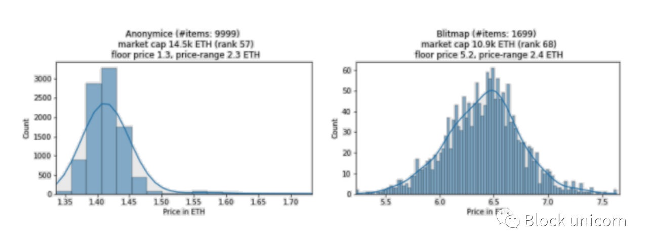
3) Symmetrical (or similar to normal) distribution means that the assets are highly concentrated around the average price and gradually decrease on both sides. About 5% of the collections we sampled exhibit this profile. Examples include Anonymice, Blitmap, and Rollbots.
4) The multimodal distribution exhibits multiple bumps and spikes over a wider range. About 20% of the collections we sampled exhibit this profile. Examples include VeeFriends, Autoglyphs, and FLUF World.
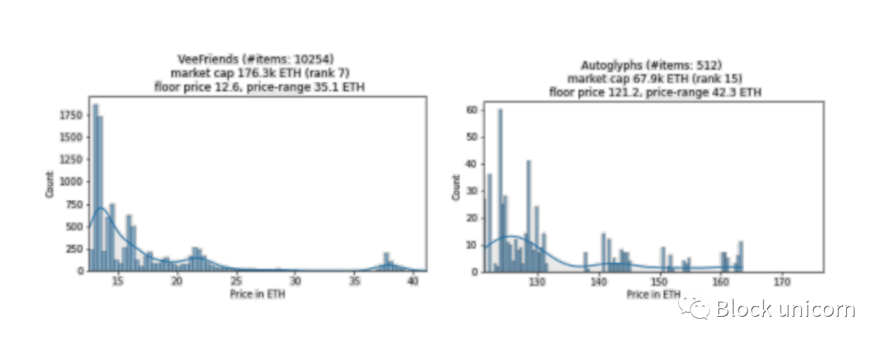
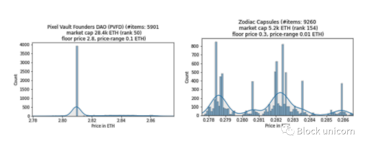
5) The point distribution pattern has one of the above shapes, but the price is distributed at <0.1 ETH. Since we define this as roughly the same price, we label these as "point distributions". This shape is a common feature of the smaller hat collections (except for PVFD, none of the top 100 collections have this shape) - so they act as filters. About 15% of the collections we sampled exhibit this profile. Examples include PVFD, Zodiac Capsules or PEGZ.
Interestingly, NFT categories (PFP, virtual land, game assets, etc.) are independent of the shape of the price distribution. For example, the virtual land NFTs in Cryptovoxels, Decentraland, and Somnium Space all have different distributions (exponential, lognormal (symmetric in Jan/Dec data, respectively), and multimodal).
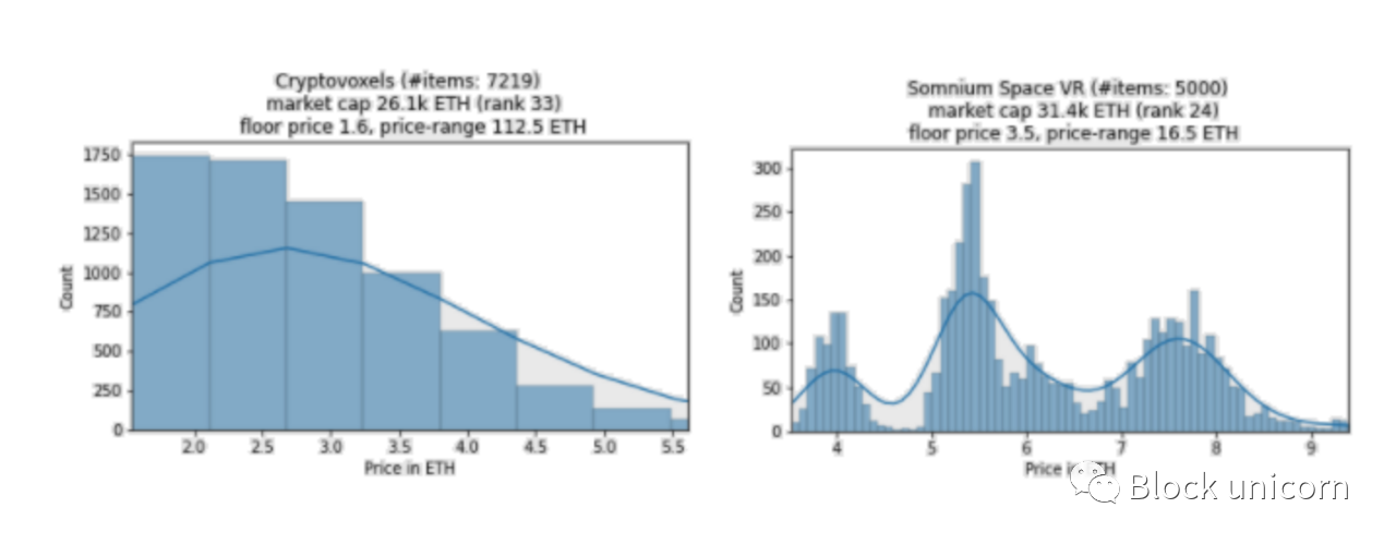
The price distribution is likely a function of inherent characteristics of the collection itself, rather than the NFT category it belongs to. For land, this could be location, plot size, foot traffic (income generating potential), land that is already built and therefore sold at a premium, etc.
Next, we investigated whether these price distributions change over time.
The price distribution (usually) stays the same
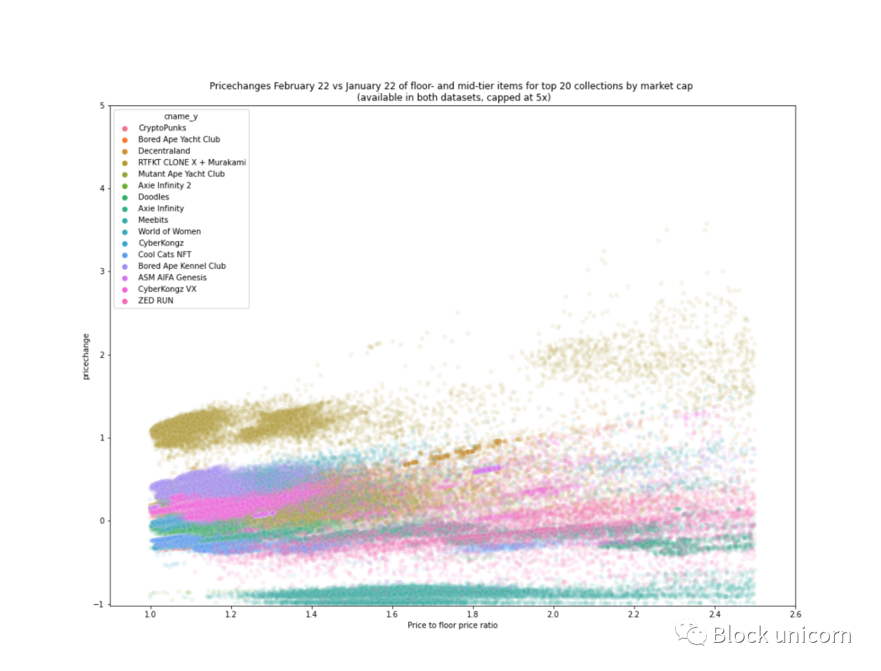
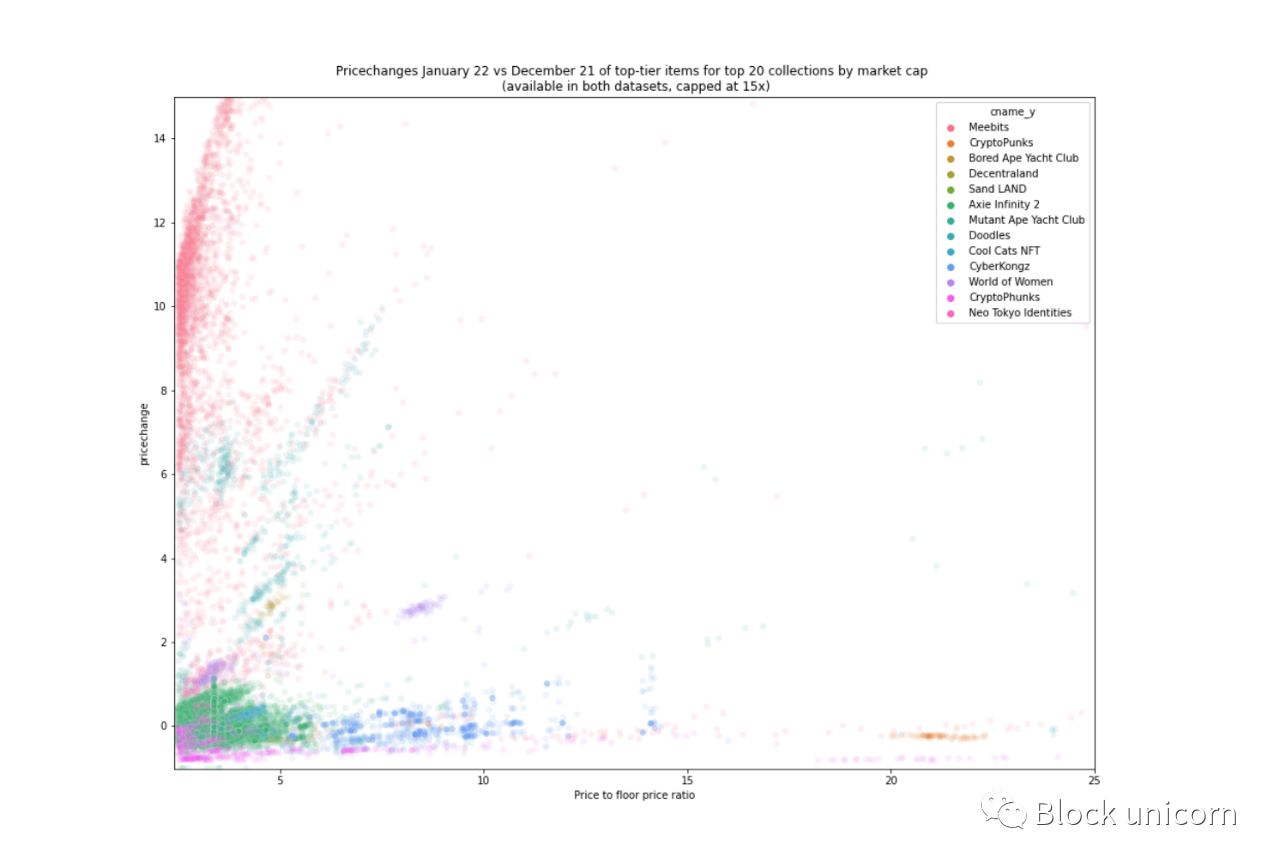
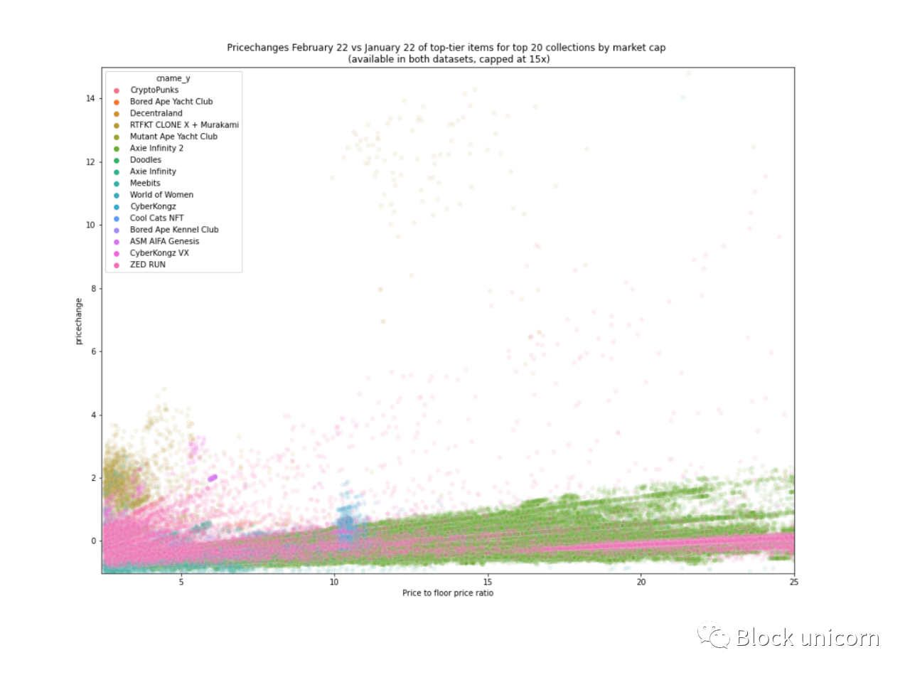
Due to the limited data here (3 data points), only time will tell if the analysis here will continue into the future. Looking at the normalized prices again, we can see that the price distributions for December (grey) and January (red) usually (but not always) coincide with or at least have a similar shape to that for February (blue).
Of the 537 collections included in both January and February data, 166 had a change in price distribution shape (30%). We also saw a similar percentage change (25%) from January to December. That might sound like a lot, but keep in mind that the categorization of the distribution shape of the set above is a bit vague, since we're not too strict about the cutoff.
For example, one can differentiate between exponential decay and lognormal: "if mode > floor price => lognormal". Looking at the pattern-to-floor ratios below, we chose a looser definition and allowed the patterns to be even 10%-20% above the floor as we looked at the fitted distribution to classify their shape.
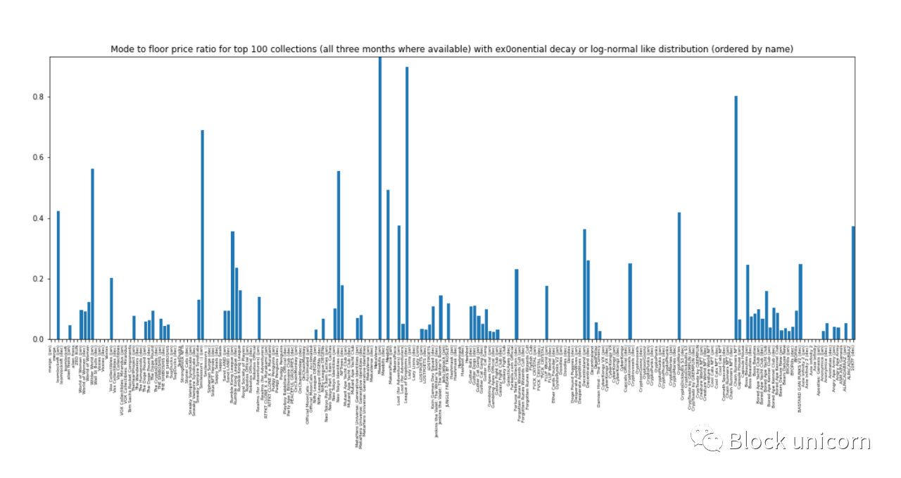
On this basis, we consider the exponentially decaying distribution and the lognormal distribution to be "related".
For the case where a change in the price distribution is observed:
~42% changed to or from a point distribution. Point distributions come in one of the other four forms, but with very narrow price ranges.
~26% change from exponential decay or lognormal to multimodal. The definition of this class is also softer, since our distribution usually only has one schema. We define this shape to separate distributions like VeeFriends and its several bumps (patterns) from other shapes.
~22% is the exponential decay to/from the lognormal distribution (this number would be much higher if we had taken a rigorous approach).
The remaining variation of ~10% was symmetrically distributed, with the lognormal accounting for a major share (6%). This is also due to the fact that the line between the lognormal and symmetric distributions is rather loosely defined (i.e. the two shapes are also "correlated").
text
text
Defining the floor: We investigated different floor quantiles and their ratios to floor prices.
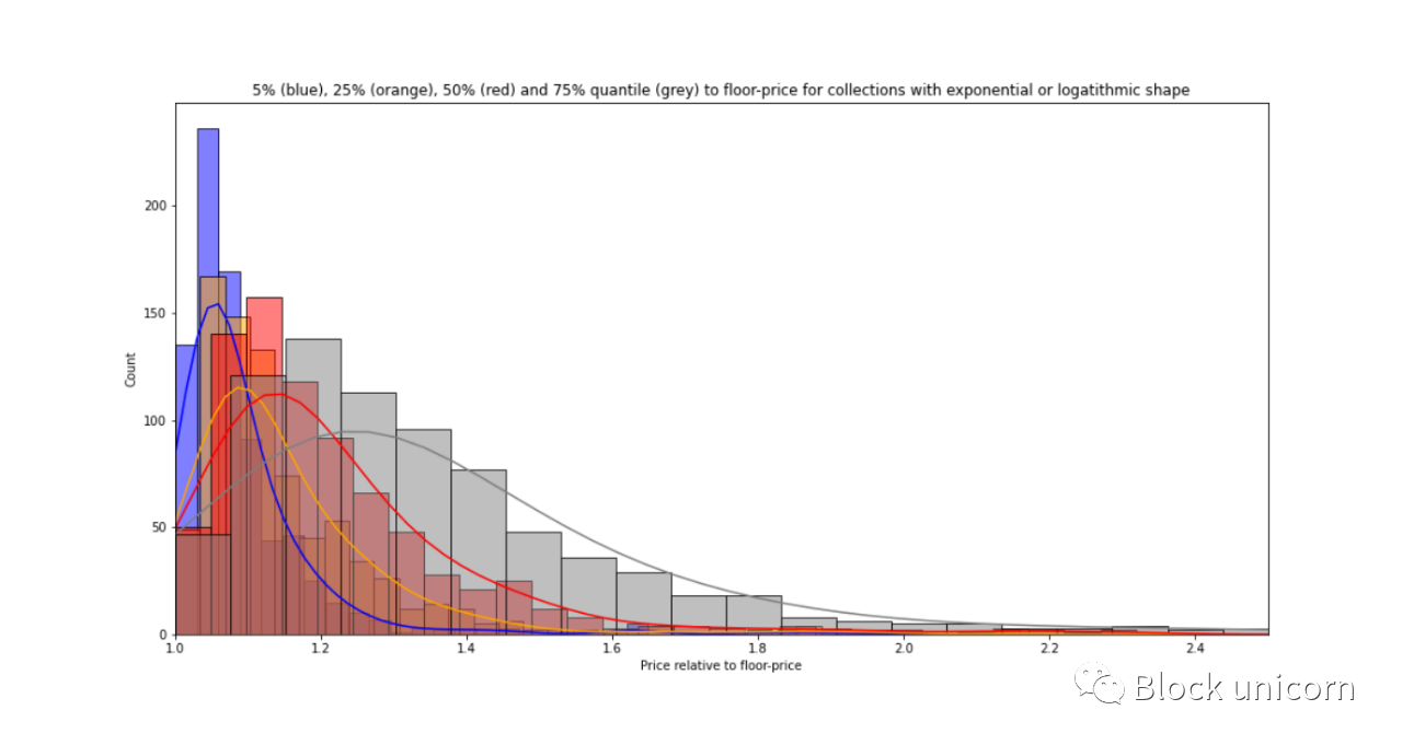
Of the 800 items in the collection, about 90% had a median price below 1.4* reserve price. Choosing a threshold here depends more on the use case we have in mind: if we include a larger share of collection items further to the right, we run the cost of expanding their price range, making the collection less homogeneous .
To make the threshold work for about 90% of the collection, the threshold is:
1.3 gives a 25% quantile (thus covering 25% of the items).
1.4 gives about 50% quantile/median.
1.75 represents the ~75% quantile.
Less than 30% of the collection may be too small, and the price range of [reserve price, reserve price * 1.75] may be too wide. Therefore, we choose a multiplier of 1.4 as the lower bound. In other words, "floor" items refer to items within the price range of [floor price, floor price*1.4]. For two-thirds of the collections, this includes 75% of the objects.
Defining top-level items: We can follow a similar route using top-level quantiles:
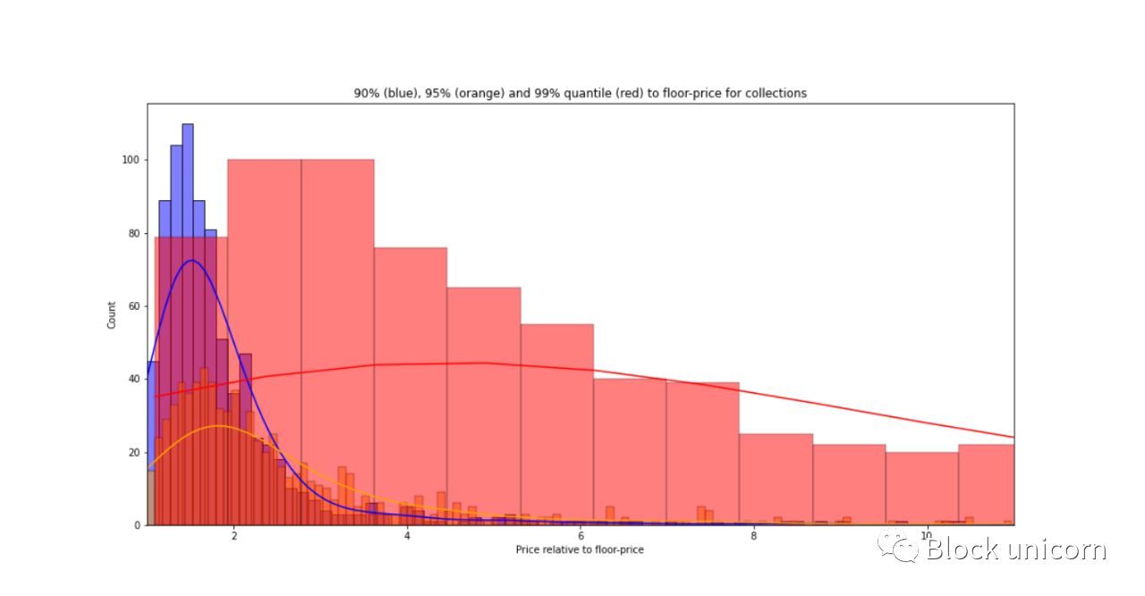
A threshold of 2.5 covers 90% of the collections - 85% of the 800 collections. It also includes 95% of collections in two-thirds of collections, and even 99% of collections in ~20% of collections. In other words, a threshold of 2.5 would place the top 10% of assets in the "top" bucket of 90% of the set.
Again, we can do more exclusive operations on this set, for example increasing this threshold to 4.
Under these definitions of bottom price and top price, we can define mid-range products whose price is between [bottom price * 1.4, bottom price * 2.5]. Now let's look at the features of these price ladders.
Define the characteristics of the price tier
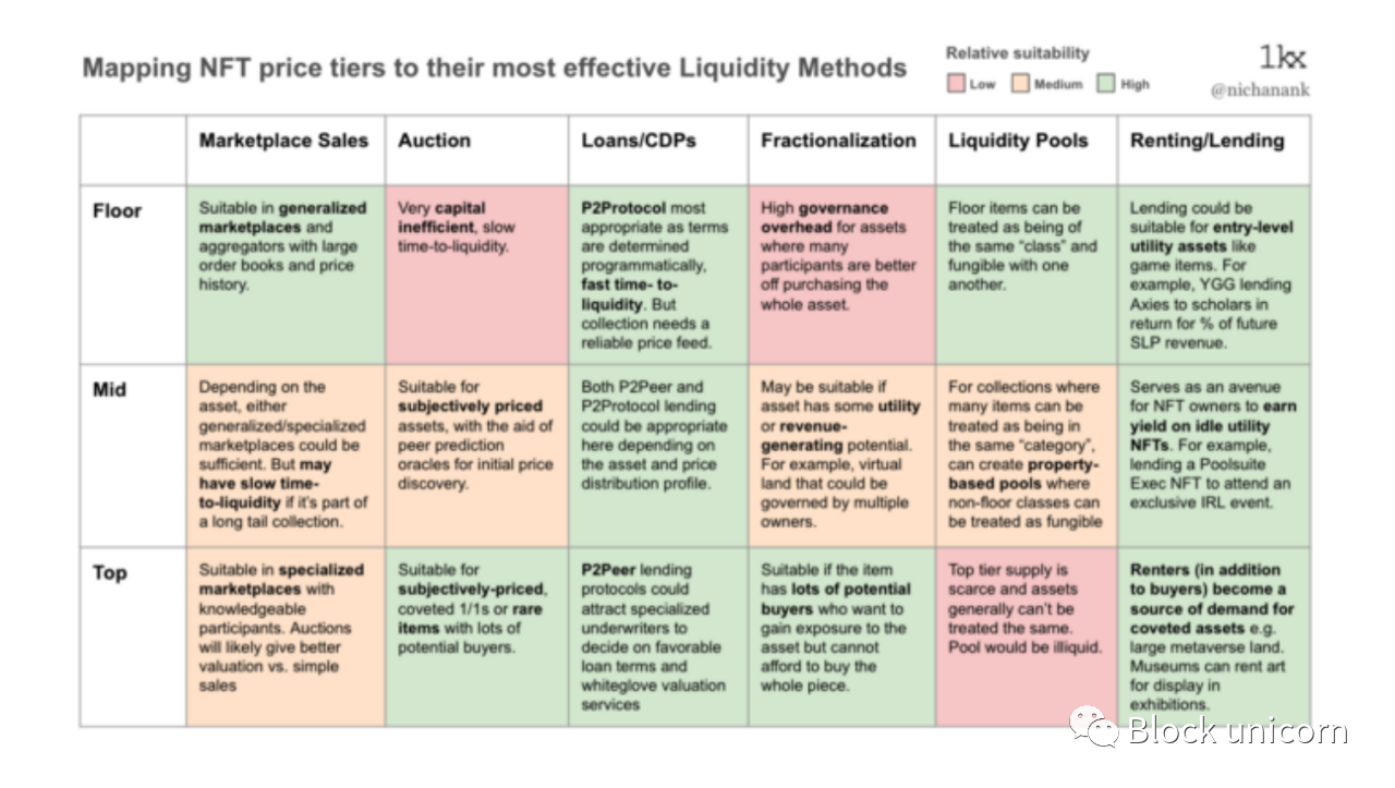
Items priced at reserve price to reserve price * 1.4.
Floors typically make up 50-75% of a collectible and 25-50% of its market value. Their volume and homogenous behavior make them suitable for liquidity pools, effectively acting as "floor AMMs", where users can earn benefits from trading activities of assets on the floor and enjoy the deepest liquidity compared to other price tiers.
Item price base price*1.4 to reserve price*2.5.
The floor price usually accounts for 20%-40% of the product and 10%-20% of the market value of the collection. As it stands, mid-range products are probably the least profitable to trade, as they require less liquidity than pit trades and they have less exposure to reflexive gains than Grails. Aggregates, where the modes are mid-range (those with symmetric price distributions), are likely to be the ones in which many users are more interested in the properties or utility of the asset itself than the price. For example, a virtual land floor may be too small or in an unprofitable location, while a large, high-traffic land may be too expensive or not for sale. Therefore, land buyers look for assets with good location, land size and price
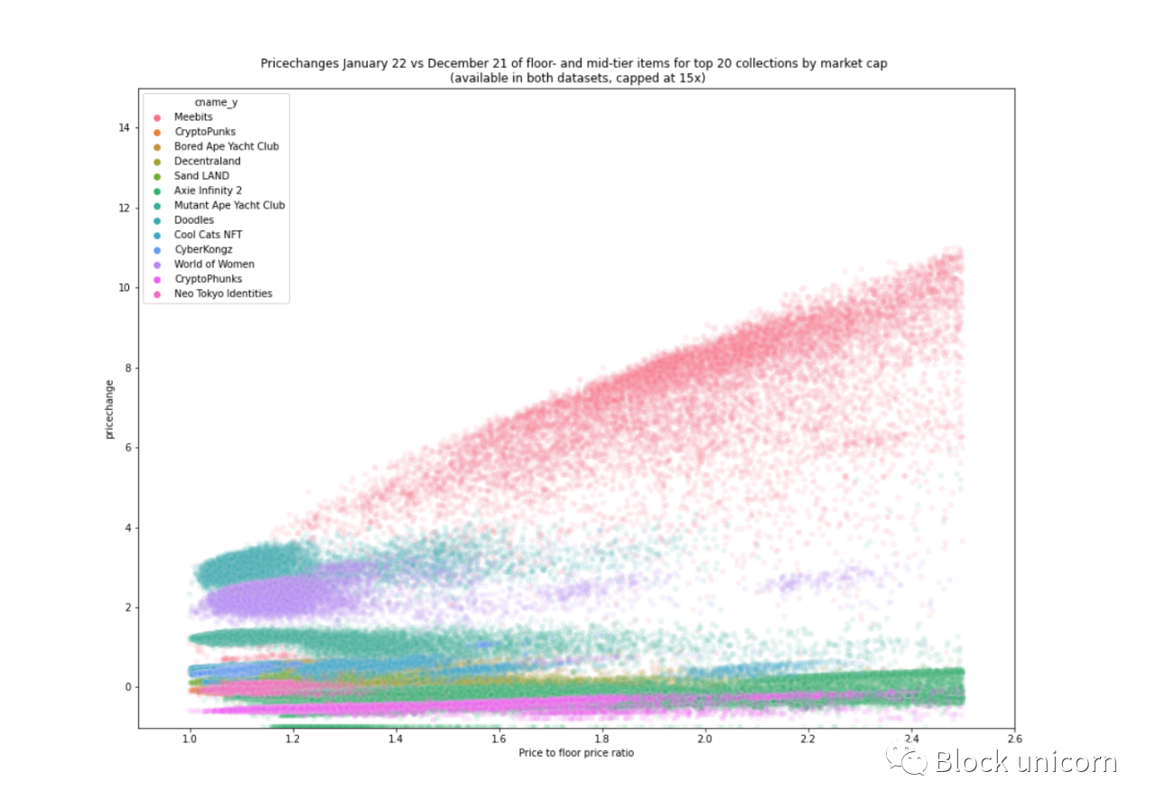
If it turns out that the floor price contains some "temporary" items, i.e. the floor price rises or the price falls, then this could be a layer of speculation and related hedging applications.
TOP or top item, commodity price > reserve price * 2.5.
Top items usually account for 5%-10% of the merchandise and 20%-40% of the market value of the collection. Antique sales are very noisy and highly variable in price, behaving like "traditional" art or high-end items in real estate. Although their transaction volume and speed are low, they have good potential to be used as collateral or for liquidity through spinoffs.
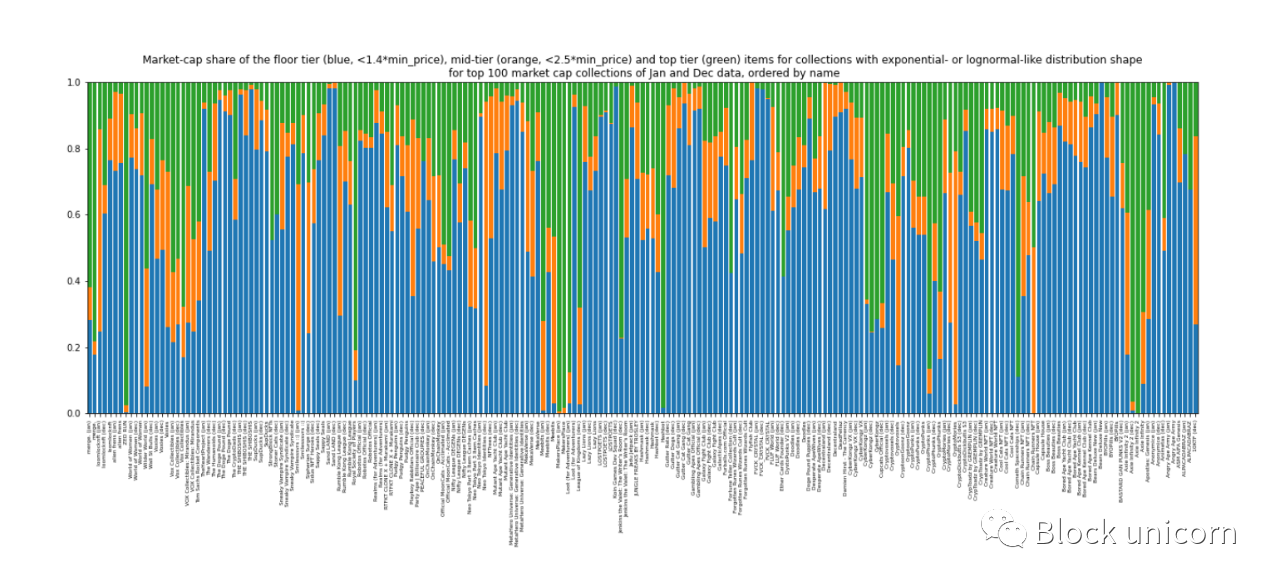
Regarding the share of items for each of the three tiers, we see a large share of floor items (blue). It's small here and there, but that has to do with the vague definition of our shape, for example Meebit (first column) doesn't quite follow our hierarchical logic because it has these extra bumps we showed further above:
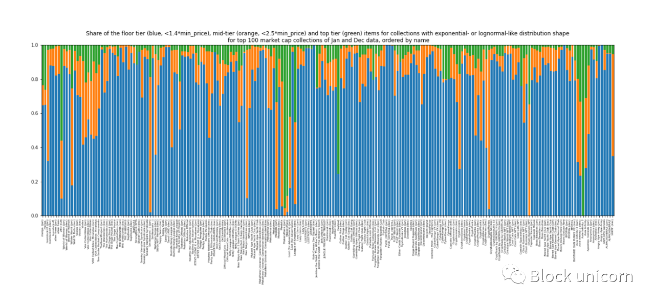
The collection names are small, but a (Jan) or (Dec) at the end of the name indicates that it is from the January or December dataset respectively.
When we look at the market share of each tier of price, things get a little bit noisy with respect to the market cap share of those tiers. While flooring still seems to hold the majority of the market share, it is not uncommon for collectibles to have cups 10-1000 times higher than flooring, eroding the value of the collectable.
Overall, about 25%-50% of the market capitalization belongs to the lower tier, 10%-20% belongs to the mid-range, and 20%-40% belongs to the top:
future career
In this paper, we take some preliminary steps to classify NFTs according to their price-moving behavior and layers in their respective collections. As we mentioned above, the bounds of the layers can be adjusted depending on the use case. For us, one of the goals is to derive common behaviors and characteristics of NFTs across collections and asset classes to inform holders on the best way to find liquidity, and this analysis helps inform this evaluation matrix.
Now that we have a high-level overview of how assets behave in a collection, we can zoom in on the salient observations we made here and analyze it further, for example:
What are the main properties of given sets that might cause them to have the price distribution patterns they do?
What internal (e.g. project development) or external (e.g. market sentiment) factors cause a given series to change the shape of its price distribution over time?
Can price distribution be a leading indicator or analytical indicator for a given financialization protocol to load a given asset (e.g. collateral or launch an NFT AMM)?
We hope to explore these issues in future articles. We currently provide a quantitative mental model for defining price tiers, as well as an initial framework for evaluating our assumptions about our approach to NFT liquidity in the coming months.


